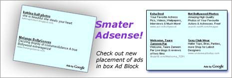
Google AdSense program is undergoing number of changes. Recently click-able area of ad was restricted or reduced to only text and not the whole ad unit. Now just saw new way of showing ads in box type ad unit. Generally ads are shown in vertical form, one after another in box type ad units (eg 300px ad unit).

This new form of placement show 4 ads in four different corner of the whole box unit. This looks very refreshing and click-able as this resemble four 125px ad blocks in big ad block. Also, with continuously changing placement of ads in the big ad block on each page refresh, chances of more clicks are in the offering. Here is enlarged version of Ad placement in focus:

There was a talk of dropping income with reduction of click-able are. Such changes will help in checking that drop. Adsense team is surely working hard to bring in new improvements in the program. This all good for advertisers as well as publisher, what say?
