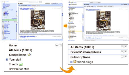
Google Reader just lost its curves and color for new crispy fresh look. Today, when Google Reader window came up – it loaded very quickly with lot of white instead of blue. First thought, my internet connection is buggy and didn’t allow style images to load. Well, there was a message at the top, announcing the new look of Google Reader and clearing the look thing for me.
Google Reader Blog annouce the change “… So, in order to make Reader act and feel more speedy and responsive, we’ve removed some visual clutter, simplified some features and given everything a bit more breathing room. Out with the old rounded corners, drop shadows and heavily saturated colors – in with a softer palette, faster components and a fresh new look.”

Besides the look, few functional aspects have also been addressed like ability to collapse navigation, separate shared items section and ability to hide unread count. Overall look is all cleaned up and this for sure is welcome change. Try your Google Reader and see for yourself!
